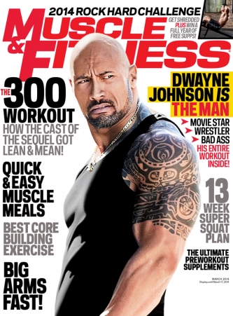
This magazine is a fitness magazine. By the looks of the magazine, the audience is most probably going to be men between the ages of 25-40. This is because of the main image, which a picture of a well known actor, Dwayne Johnson, who many men would want to be like in terms of their physique. The magazine also uses cover lines the 'The 300 workout' which suggests that people who have watched the movie would be a possible audience of this magazine. Also the audience may be men from the ages of 25-40 years old because there is a lot of pressure on men to build the perfect physique and coverline such as ' BIG ARMS FAST' suggest that men in that position will be most likely the audience as the contents of it is in their best interests.
The colours on this magazine also suggest that the audience of the magazine will be of the ages 25-40 as the colour schemes emulate the colour scheme of some GQ magazine covers, and GQ target men the ages of 25-40 years old.
The audience of this magazine may also be fans of Dwayne Johnson who try to be like him. This is because we see the main image of of Dwayne Johnson alone and then there is a coverline on the magazine that says 'DWAYNE JOHNSON IS THE MAN' and 'HIS ENTIRE WORKOUT INSIDE!'. Such cover lines make people want to buy this magazine for the reasons that it will be of personal interest to them and this makes it easier for them to buy the magazine and read it.
The magazine cover uses big bold font for the cover lines and they are organised to make sure that the main image isn't being overlapped by cover lines. Additionally, the cover lines are organised all down the sides of the magazine which means that the readers will read the left side first the the right side.
Similarly to other magazines of this genre, the main image is overlapping the masthead and and all the cover lines are placed around the main image so that there is more of a focus on what the magazine is trying to portray. This will most likely attract an audience that are drawn in by the main image.
No comments:
Post a Comment